About project
My role: Ux designer designing a responsive website for finding and viewing dance classes from start to end
The goal: Create a responsive website that not only delivered high-quality dance tutorials but also incorporated interactive features like augmented reality and real-time feedback, ensuring users could actively measure their progress.
Tagert audience: Everyone who wants to learn dancing or just love dance (from amateur to professional)
Responsibilities: Create personas, user stories, users journey map, problem and goal statement, competitive audit and report, paper and digital wireframing, low and high fidelity prototyping, research study plan, usability study, pattern and insight identification, iterating on designs
Research study details
Pain points
Accessibility Issues
Users might struggle to find tutorials tailored to their specific skill level or the style they're interested in
Lack of Personalized Feedback
Without real-time correction, users might continue practicing moves incorrectly, leading to frustration or potential injury
Overwhelming Choices
With an extensive catalog of dance styles and tutorials, some users might feel overwhelmed, unsure of where to start or how to progress
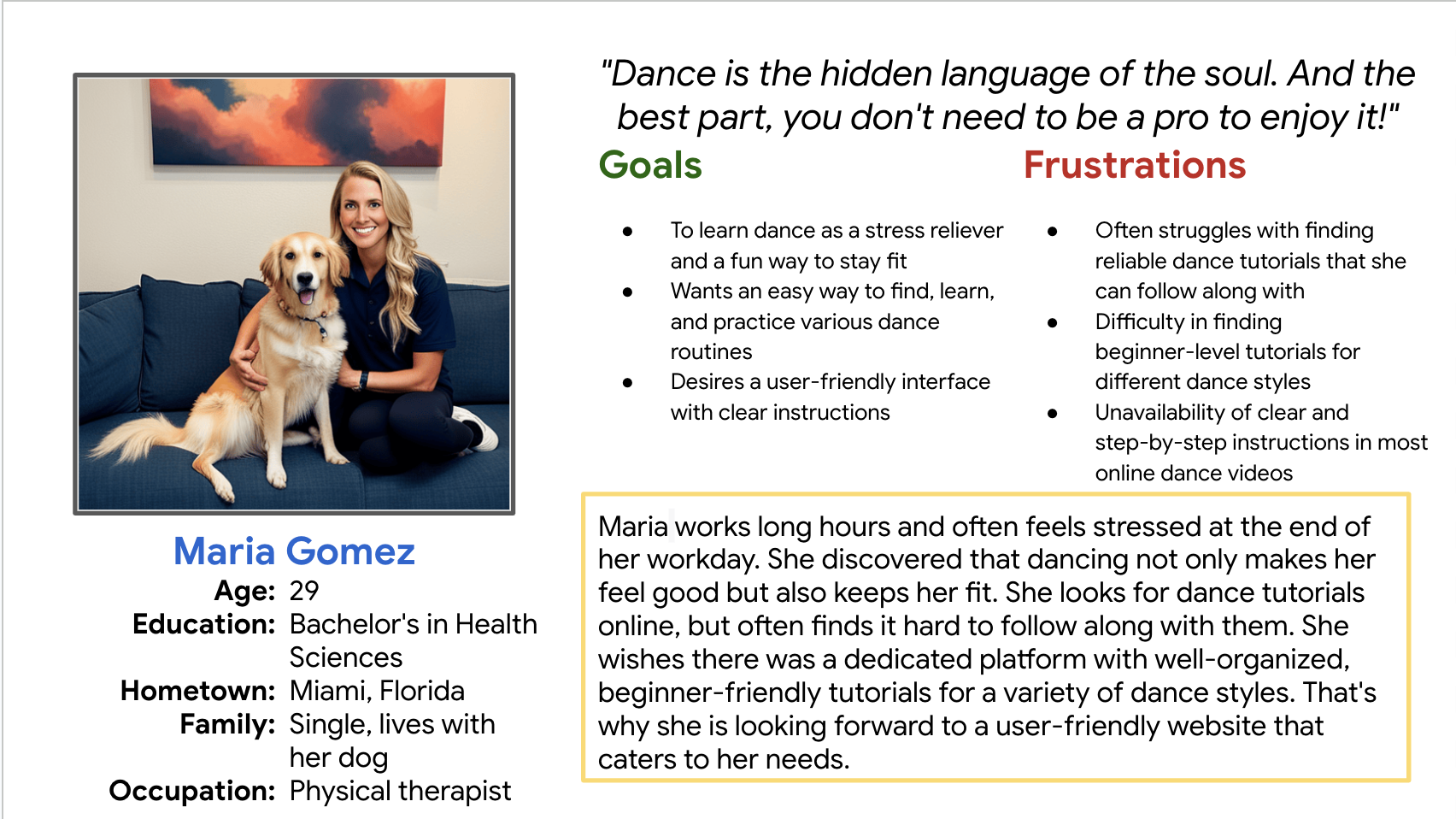
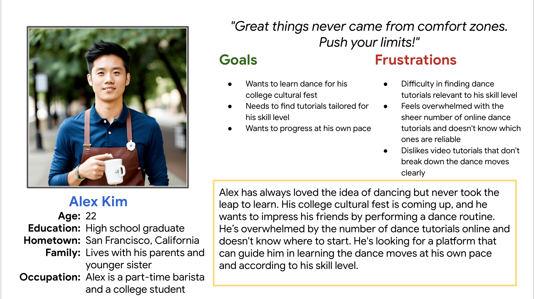
Personas
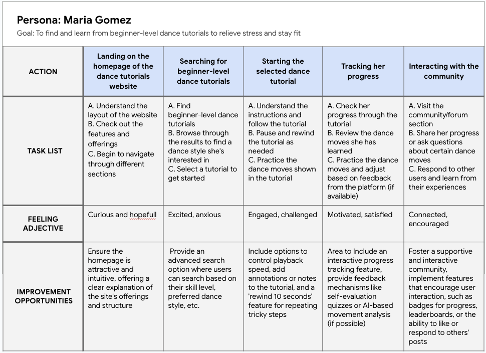
User journey map
User stories
Maria Gomez
As a physical therapist who enjoys dancing for stress relief, I want to find beginner-level dance tutorials easily so that I can start learning without feeling overwhelmed.
Alex Kim
As an college student preparing for a cultural fest, I want tutorials that are categorized according to skill level so that I can find content that matches my current abilities and helps me progress at my own pace.
Research summary
I conduct user research through personas, create user empathy maps, and describe the problem statement. I also conduct a competitive audit. The research indicates that the application is suitable for everyone. From individuals who simply want to use dancing as a form of exercise and stress relief to those who aspire to learn dancing professionally.
Initial design concepts
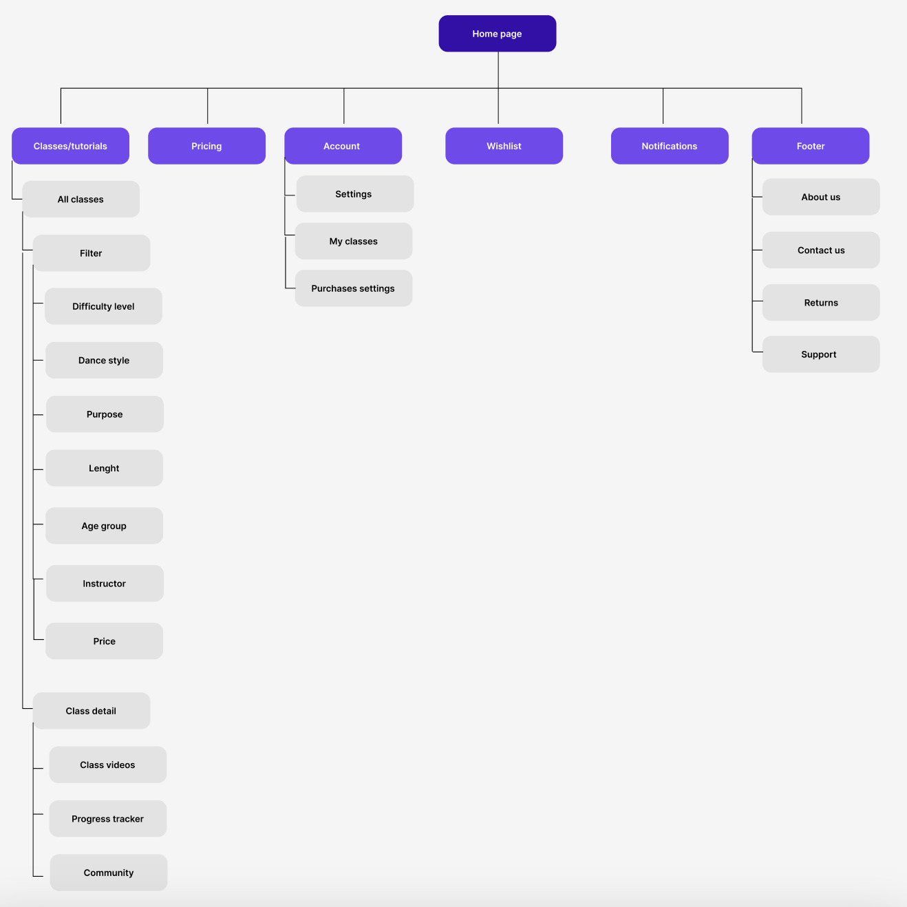
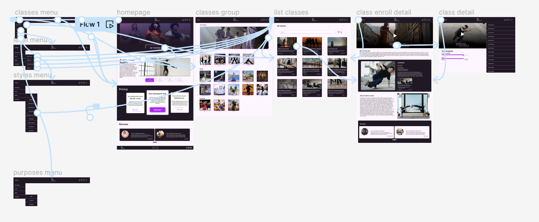
Sitemap
Paper wireframes
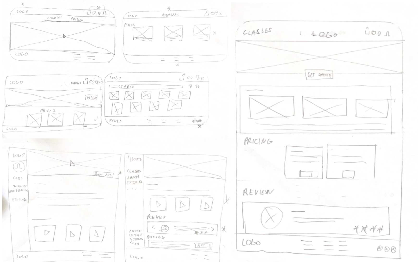
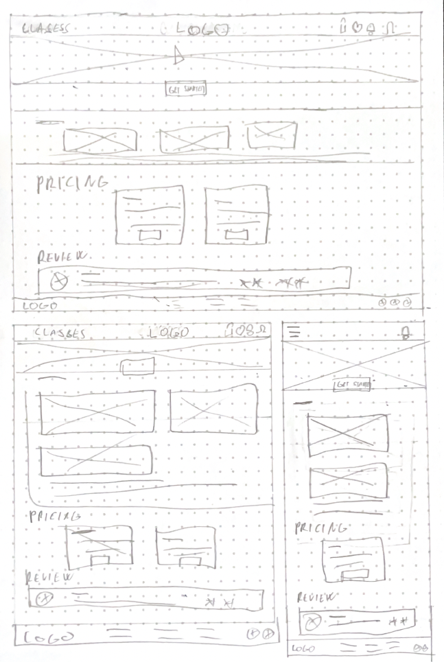
Paper wireframes for responsiveness
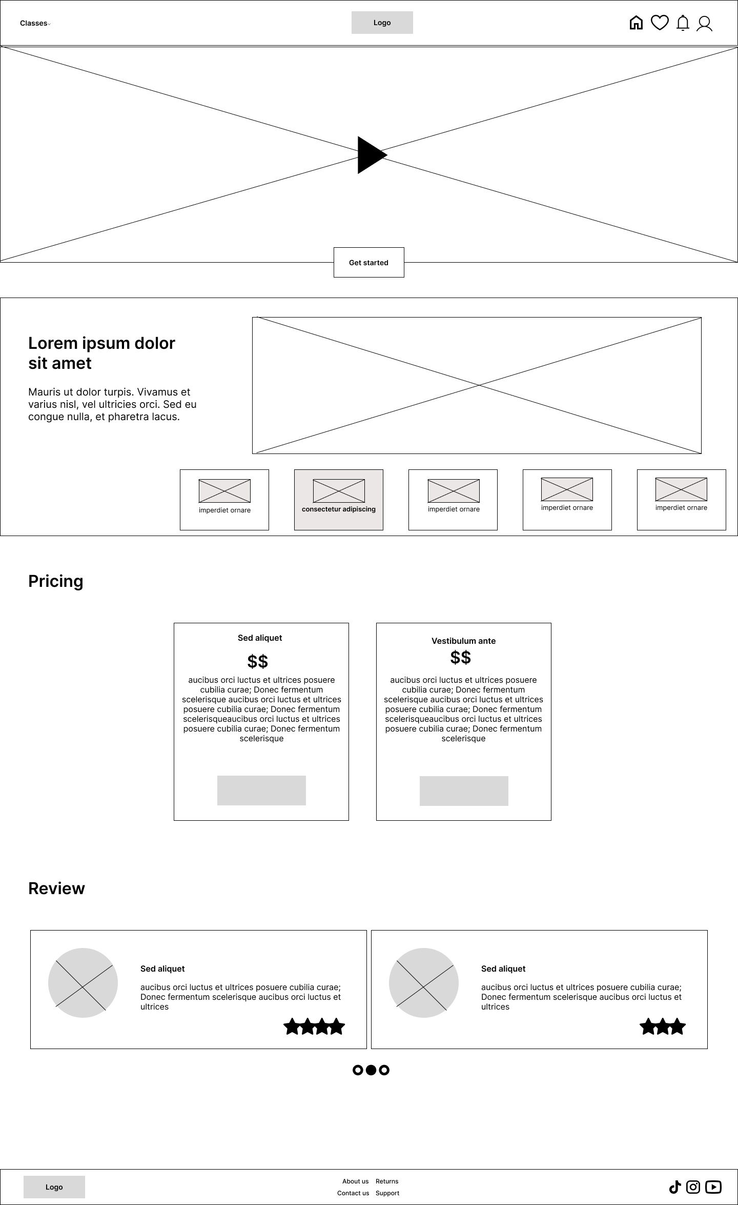
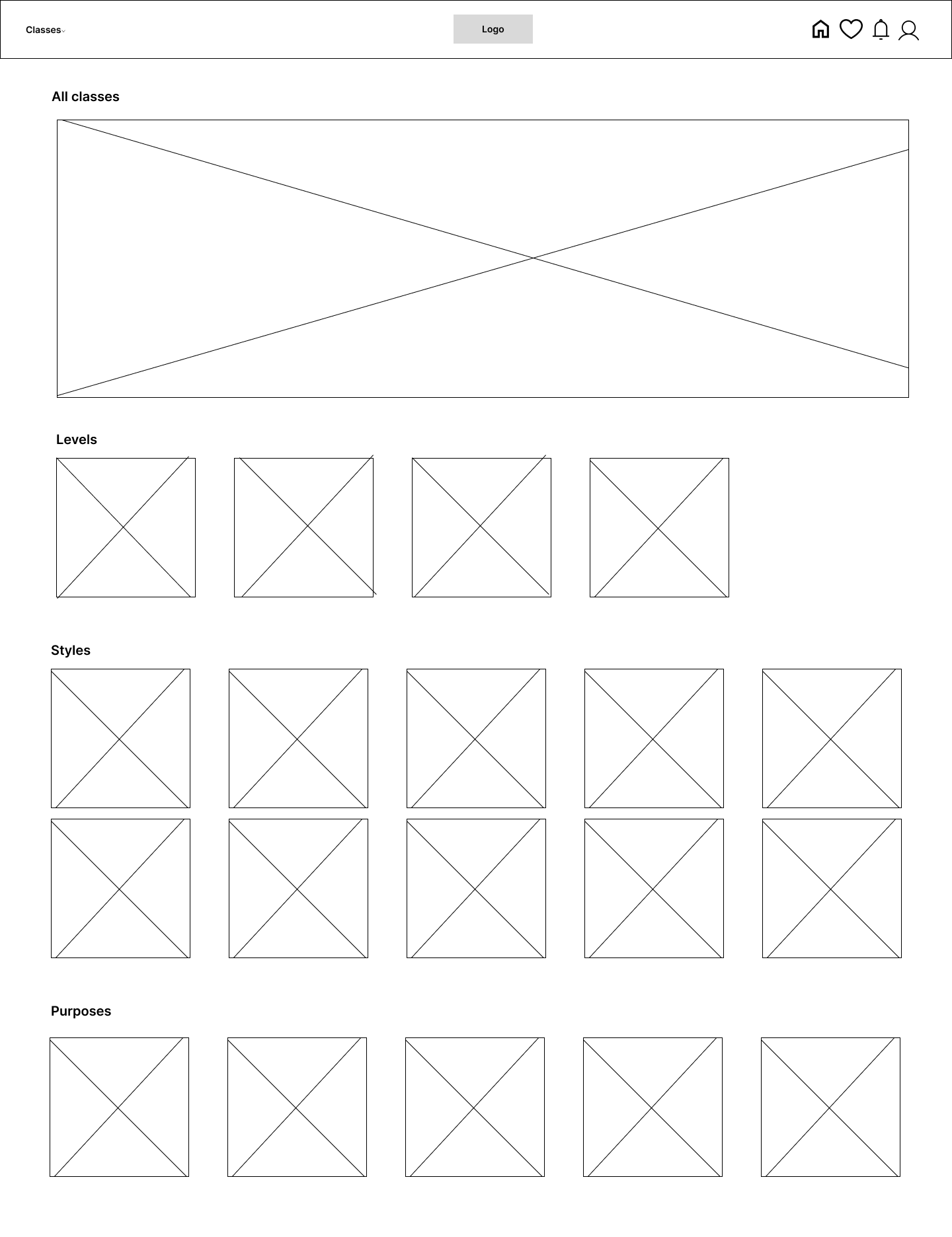
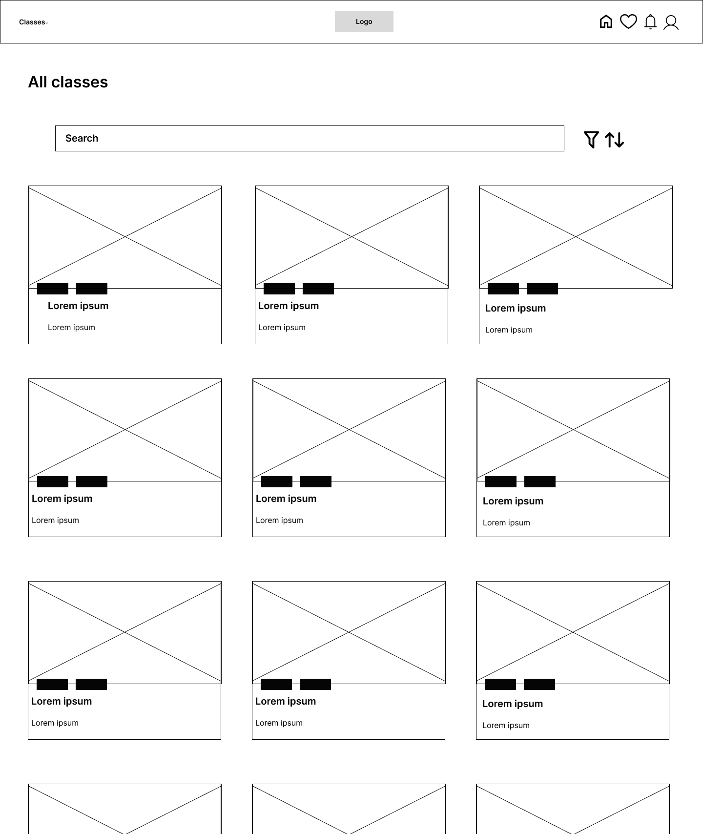
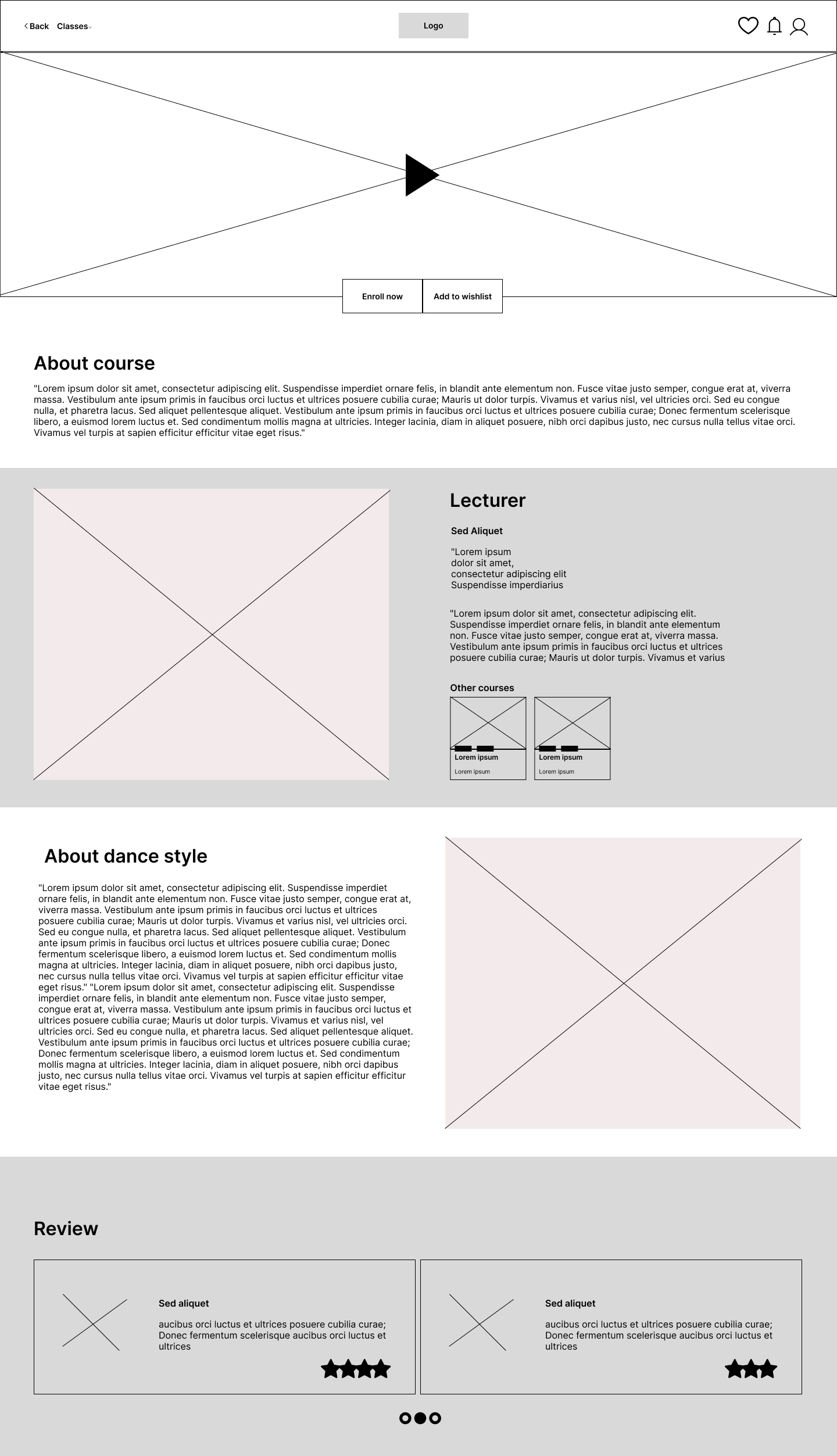
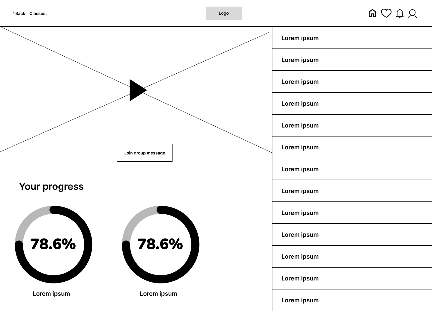
Digital wireframes - desktop
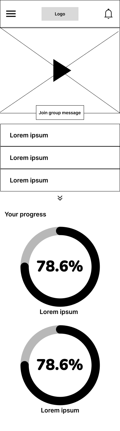
Digital wireframes - mobile
Usability study
I conducted usability study. Tests were conducted on wireframes.
Usability study findings and solution
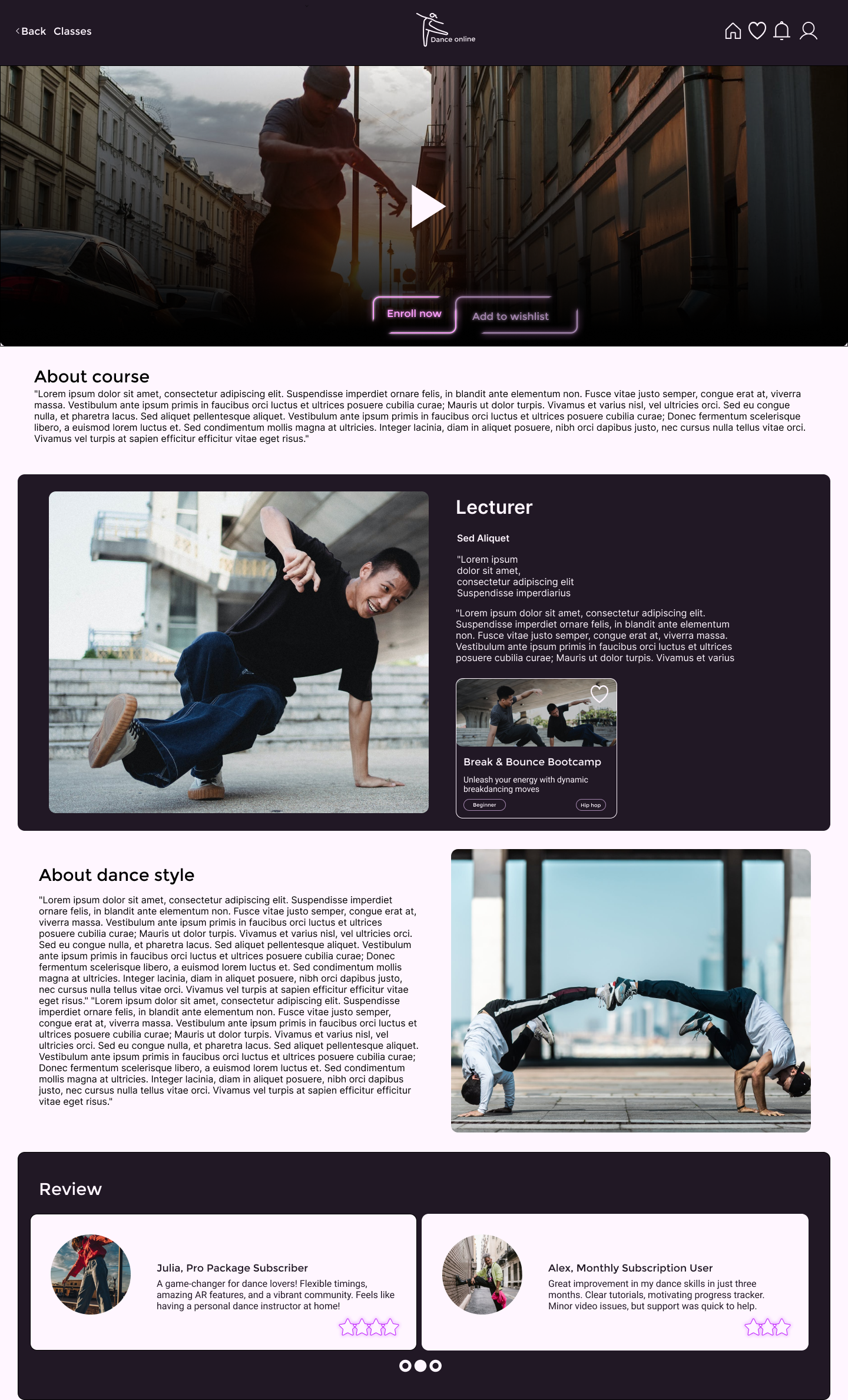
Class detail
Problem: When the user is on the class detail page, there is no option to go back
Solution: Added a back button for easier navigation to the previous page
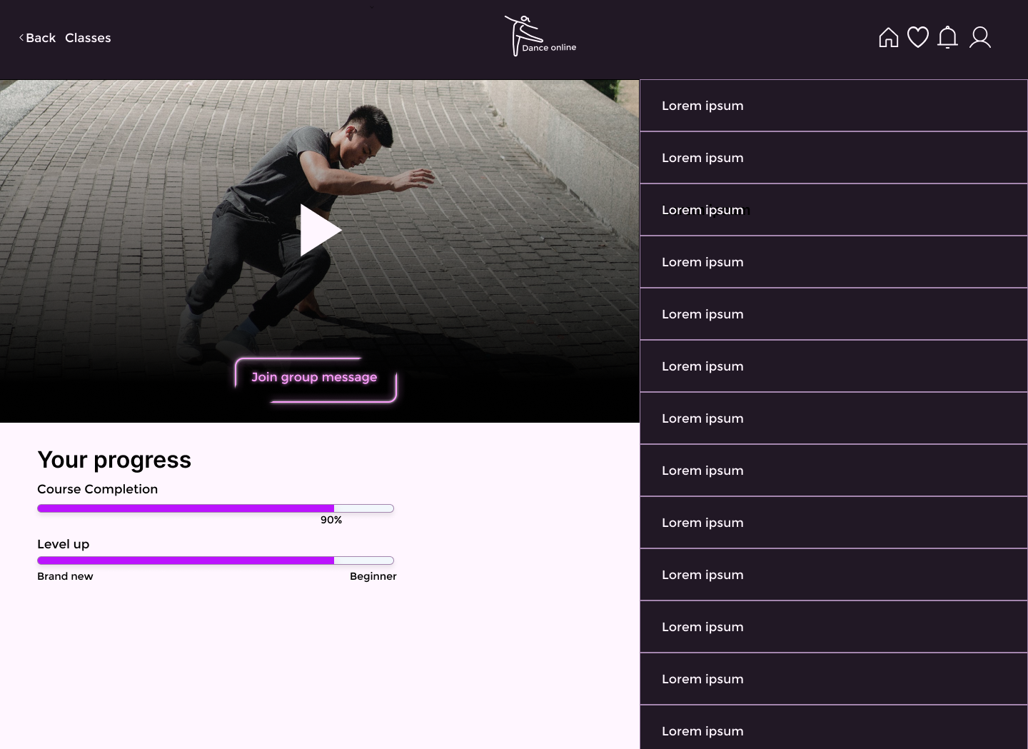
Home page link under logo
Problem: Some users were confused about how to return to the homepage
Solution: Added a home icon for clearer navigation to the homepage
A separate page with common group of classes
Problem: After clicking on 'classes' in the navigation, users were taken to a separate page, which some found distracting
Solution: Added the option to select from the navigation, making it quicker for users to find what they need. However, the possibility to choose from the separate page still exists
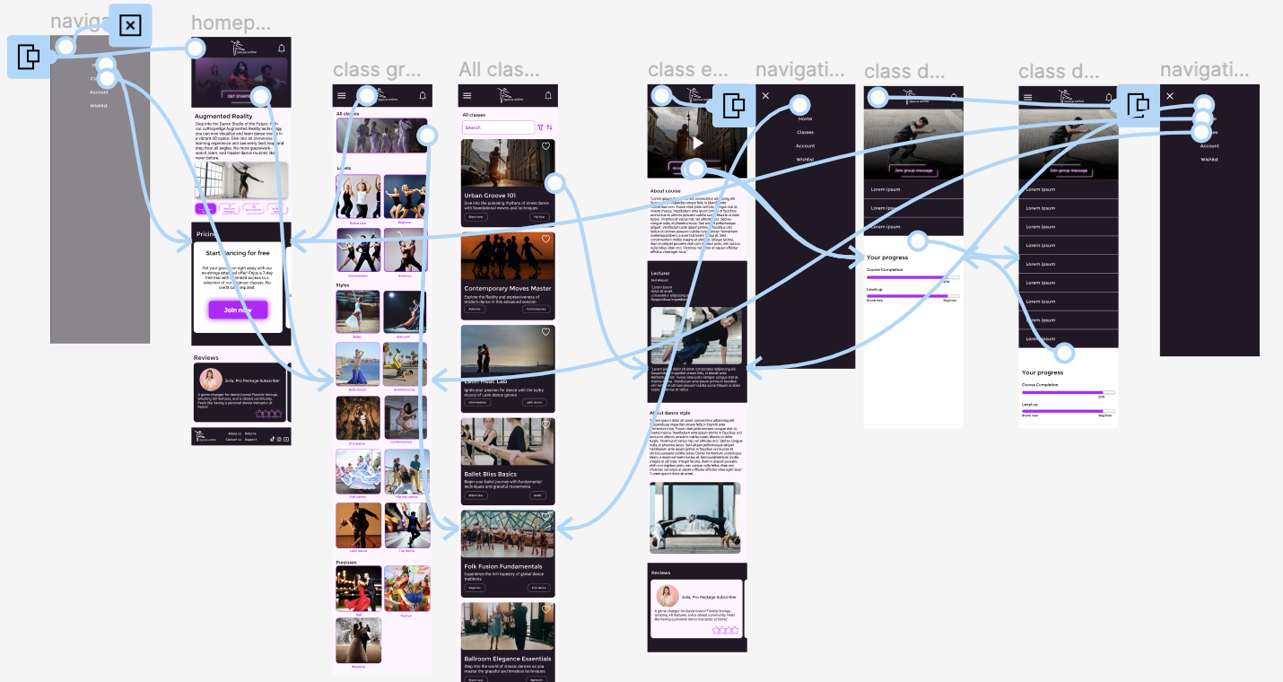
Final design
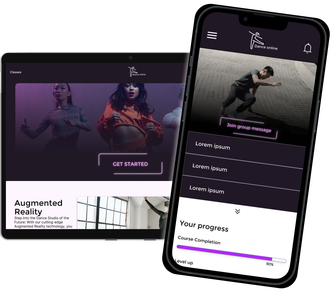
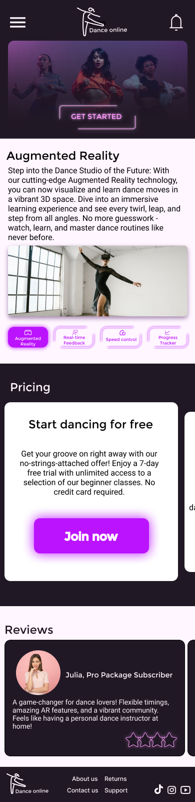
Mockups - desktop version
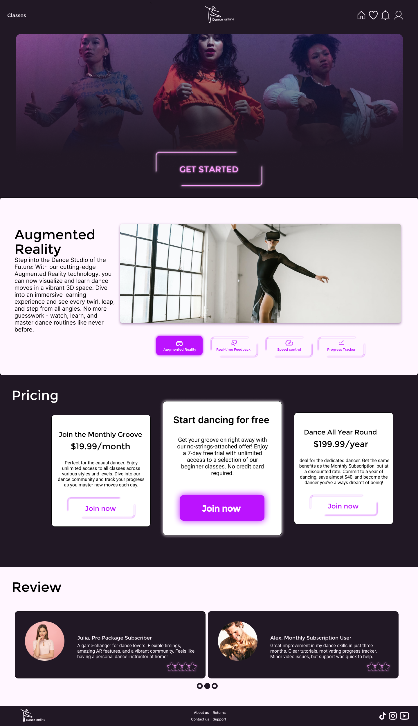
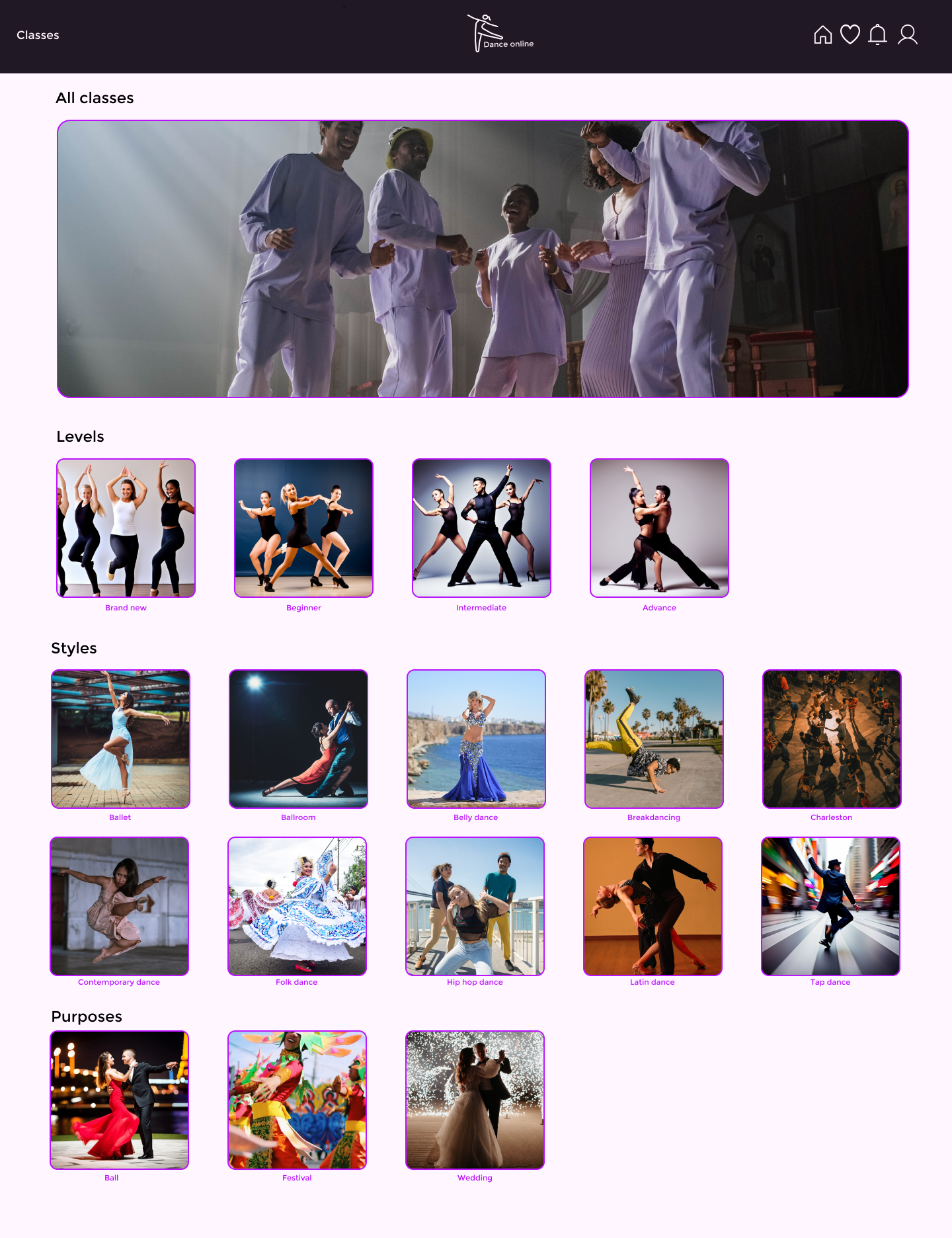
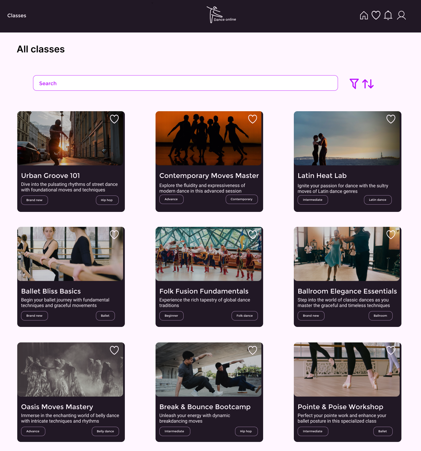
High-fidelity prototype - desktop version
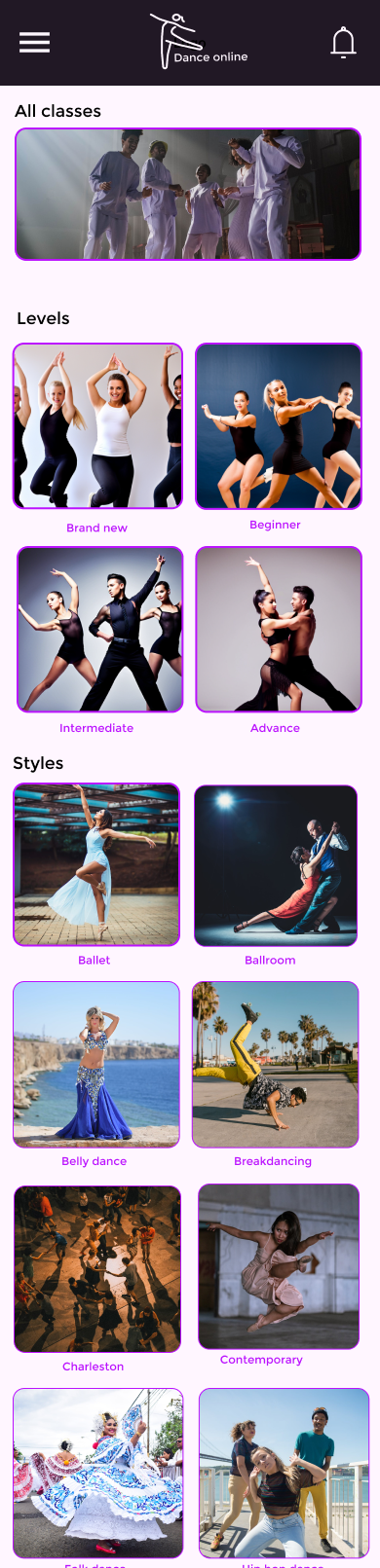
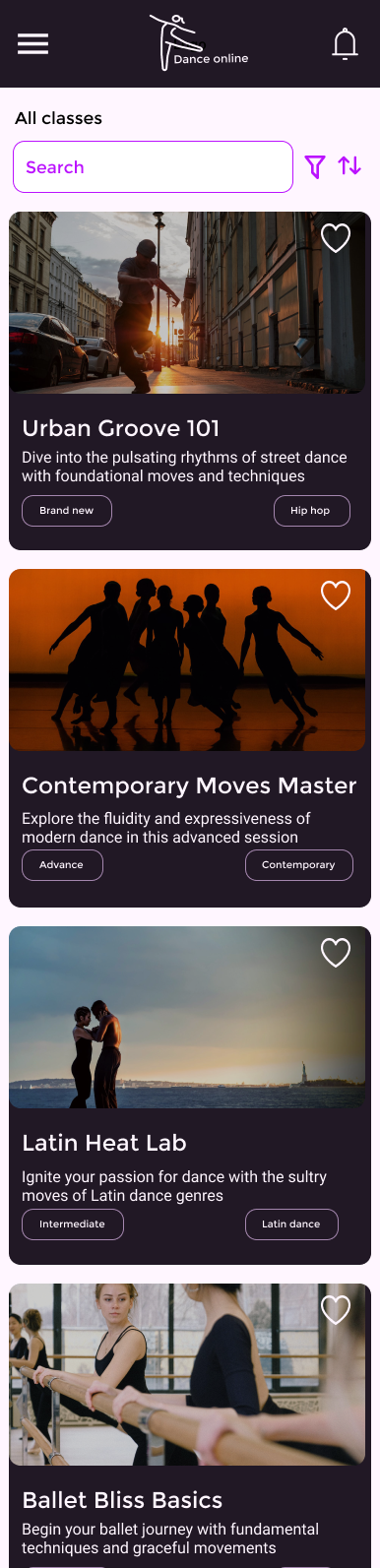
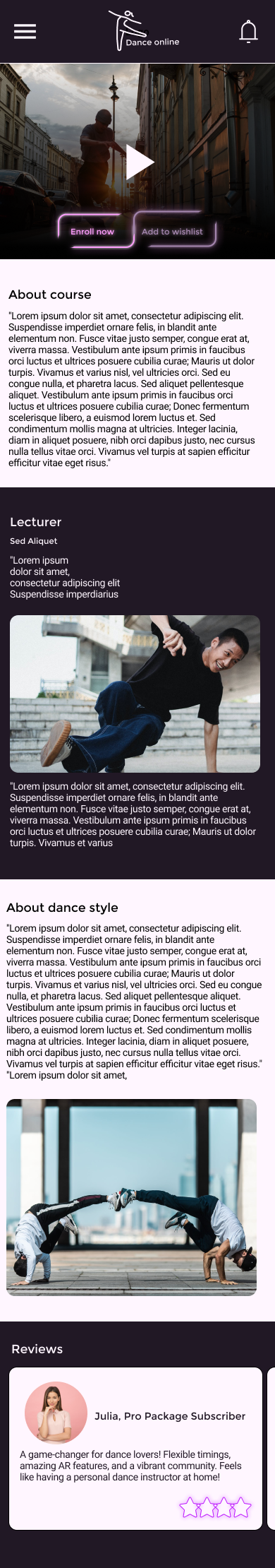
Mockups - mobile version

High-fidelity prototype - mobile version
Conclusion
What I learned I learned about the UX/UI process from scratch to the end
Possible next step: Conduct one more usability testing to valid that the included changes were the right choice